Enterprise web apps place different demands on chart libraries than small dashboards or simple analytics pages. Stability, scaling, documentation, support, licensing, and predictable production behavior matter as much as good-looking charts. Financial platforms, BI products, internal systems, monitoring interfaces, industrial software, and operational dashboards all depend on reliable data visualization. Charts in these products often become part of the main workflow, not just an extra UI element. Picking the wrong library can create problems with performance, maintenance, and future product growth.
This list does not rank libraries by popularity or chart type count alone. We looked at production readiness, advanced visuals, customization, documentation, commercial support, framework compatibility, and behavior in complex products. Different tools suit different teams: some are better for performance-heavy apps, while others are more useful for business reporting or embedded analytics. The top includes four different charting approaches, not copies of the same tool. The next section explains what matters most when choosing an enterprise charting library.
What We Looked for in Enterprise Charting Tools
For enterprise web apps, a chart library needs to be judged beyond its demo page. It should fit the frontend stack, handle real datasets, support complex interactions, and avoid creating problems months after launch. Support, documentation, and licensing matter just as much as chart variety. The four libraries below cover different enterprise scenarios, from heavy browser visualization to reporting-focused dashboards. Here is the short version:
- SciChart: Best for performance-heavy browser visualization, advanced charts, and data-heavy products;
- amCharts: Useful for polished dashboards, maps, reports, and interactive business visuals;
- FusionCharts: Relevant for enterprise reporting, embedded analytics, and broad chart catalog needs;
- ZingChart: Suitable for configurable dashboards, business apps, and teams that need chart variety with control.
These libraries are not fully interchangeable. Each one has a scenario where it makes the most sense. SciChart comes first as the option for the most demanding data-heavy products.
1. SciChart
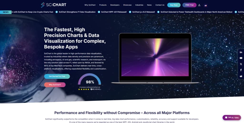
SciChart fits enterprise web apps where charts must handle large datasets, live updates, zooming, panning, annotations, and complex interaction. Financial software, scientific platforms, medical tools, engineering systems, and monitoring products are natural use cases. In many such products, SciChart for browser-based data visualization without rebuilding chart logic from scratch. It is not a universal choice for every company. Its value is clearest where chart performance directly affects user workflow.
For enterprise teams, long-term maintainability matters as much as adding the chart itself. SciChart supports advanced visuals such as 2D charts, 3D charts, heatmaps, gauges, and polar charts. Documentation, demos, examples, and support can reduce implementation risks. The library is commercial, so it may be unnecessary for small dashboards or simple reports. It is easier to justify when chart speed, interaction quality, and visual depth matter to the product.
The main advantage of SciChart in an enterprise context comes from the mix of speed, visual depth, interaction control, and production support. It gives development teams room to build demanding chart interfaces without treating performance as an afterthought. The strongest reasons to consider it are practical:
- Handles large datasets and frequent updates in browser-based products;
- Supports advanced visuals such as 2D charts, 3D charts, heatmaps, gauges, and polar charts;
- Gives developers control over annotations, styling, interactions, and chart behavior;
- Provides documentation, examples, demos, and support for implementation work;
- Makes sense for commercial products where chart speed affects product quality.
SciChart looks best when charts are a core part of the product experience, not a decorative element. The licensing cost makes sense when performance, reliability, and chart depth save the team time or reduce risk for users. For polished business dashboards and maps, amCharts offers a different tradeoff.
2. amCharts
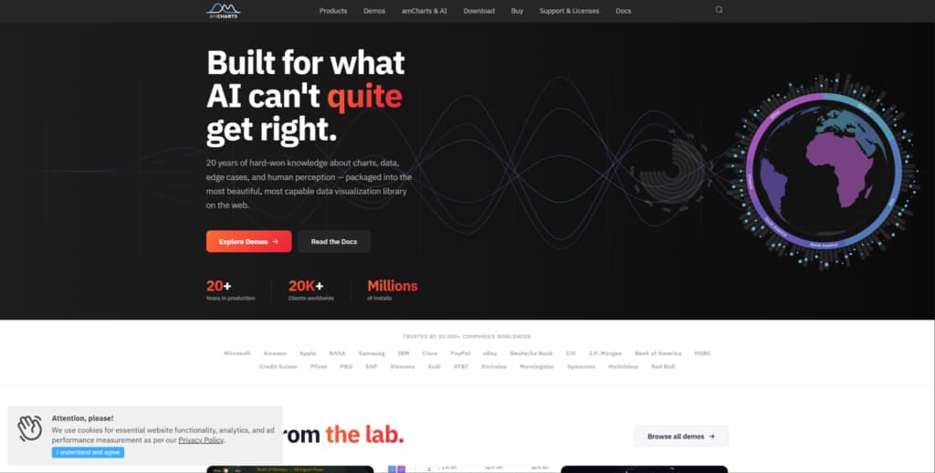
amCharts is a JavaScript charting library for business dashboards, reports, maps, and interactive data pages. It suits products where charts need to look polished and fit into customer-facing or internal enterprise UI. Teams often choose it when they need maps, standard charts, and flexible visual presentation. It is not the strongest option for extreme real-time rendering. Its stronger side is presentation quality, chart variety, and readiness for business use cases.
Large enterprise products often need more than one chart type. They usually need a set of visualizations for different teams, departments, and product pages. amCharts can help with reporting pages, geographic data, dashboards, embedded analytics, and management interfaces. It also helps keep the visual style more consistent across the product. If the main problem is extreme datasets or high-frequency updates, it should be tested carefully before adoption.
amCharts is better viewed as a library for mature dashboard and reporting scenarios. It offers practical advantages without pretending to be a specialized rendering engine. Its strongest use cases are tied to visual quality and business presentation:
- Covers standard charts, maps, and interactive data presentation needs;
- Helps teams create polished dashboards and reporting interfaces;
- Supports business products where visual consistency matters;
- Fits use cases that combine geographic data, analytics, and management views;
- Makes sense when teams need a commercial charting library with broad visual coverage.
amCharts suits business dashboards, public-facing analytics, and reporting tools better than narrow scientific or trading interfaces. It is a good choice when the presentation layer needs quality without building everything from scratch. For enterprise reporting and embedded analytics, FusionCharts covers different ground.
3. FusionCharts
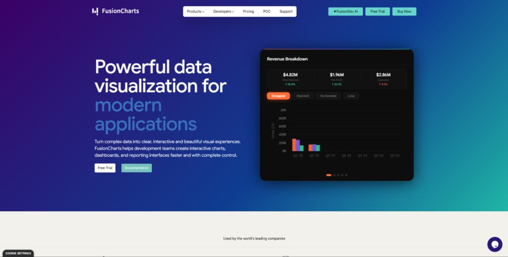
FusionCharts is a commercial JavaScript charting library for dashboards, reports, embedded analytics, and business data products. It makes sense for teams that want a wide chart catalog and ready components for enterprise reporting. Companies often consider it when charts are part of regular business analytics. It is not a performance-first engine for heavy real-time visualization. Its position is stronger in reporting and business intelligence workflows.
In corporate products, technical flexibility matters, but implementation speed, support, documentation, and coverage of typical business charts matter too. Typical use cases include executive dashboards, internal analytics tools, SaaS reporting, and customer portals. FusionCharts can reduce the need to combine several smaller libraries for different chart formats. That can make implementation cleaner in reporting-focused products. If a product needs deep custom visualization or high-load rendering, it should be compared with more specialized options.
FusionCharts should be judged by the breadth of its business charting and its convenience for reporting products. It is useful when teams want a ready charting layer for common analytics tasks. The main reasons to consider it are clear:
- Provides many chart types for dashboards, reports, and business analytics pages;
- Supports embedded analytics use cases in SaaS and internal platforms;
- Helps teams cover common reporting needs without mixing several small libraries;
- Offers documentation and commercial support for business-focused development;
- Fits products where charts support management, reporting, and customer-facing insights.
FusionCharts suits teams that need a ready business charting layer. It may be less appropriate for products where charts require deep low-level control or specialized rendering behavior. For a more configurable dashboard option, ZingChart offers a different profile.
4. ZingChart
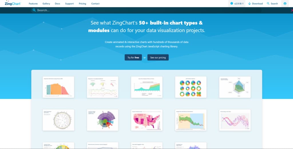
ZingChart is a JavaScript charting library for teams that want many chart types, settings, and control over dashboard visuals. It fits business apps, reporting pages, data portals, and internal dashboards. ZingChart helps when a team wants a configurable chart setup without moving to a fully low-level tool. It is not the best choice for heavy scientific workloads. Its stronger side is configurability, chart variety, and practical use in web app dashboards.
Some teams need more adjustment than simple chart components can offer, but they still do not want to build everything manually. ZingChart works for custom dashboards, internal tools, reporting systems, and product analytics screens. It helps when a product needs a mix of ready chart types and control over presentation. This can be useful in products with several dashboard scenarios. For narrow real-time or scientific tasks, the fit should be checked separately.
ZingChart is worth considering for teams that need flexibility in dashboard UI. It offers an adjustable chart setup without going fully low-level. Its strongest points are tied to variety and control:
- Offers a broad chart catalog for dashboards, reports, and web applications;
- Gives teams control over visual settings, interactions, and chart behavior;
- Fits products that need more adjustment than simple chart components allow;
- Supports business dashboards, data portals, and internal reporting tools;
- Makes sense when teams want variety and control without building charts from scratch.
ZingChart helps when a product has several dashboard scenarios and needs an adjustable charting layer. It is less natural for teams that want the simplest open-source library or a specialized high-performance engine.
Which Type of Enterprise Chart Library Should You Choose?
The choice depends on the role charts play in your product. If charts are a critical part of the user workflow, performance, interaction quality, and long-term support should come first. If the focus is on reporting or business analytics, chart variety, polished defaults, and embedded analytics scenarios may matter more. Teams building many dashboard pages should also look at support, documentation, licensing, and fit with the frontend stack. Before choosing, test the library with real datasets, real interactions, and actual product requirements. Demos can help with first impressions, but they should not replace proper testing.
Final Thoughts
An enterprise chart library should be evaluated by more than the number of chart types. SciChart fits data-heavy products where rendering, interaction, and advanced visuals are critical to user experience. amCharts makes sense for polished dashboards, maps, and reporting pages. FusionCharts works better in business reporting and embedded analytics workflows. ZingChart suits teams that need configurable dashboards and control over the presentation layer.
The right choice depends on data load, chart complexity, team skills, licensing, and the role of charts in your product. Do not choose a library only because it is popular or looks good in examples. For enterprise web apps, test how charts behave with real data, interaction patterns, and future product needs. A cheaper or simpler option can cost more later if the team loses time on maintenance. The best chart library for an enterprise product is the one that handles real scenarios, not just the one that looks good in a demo.